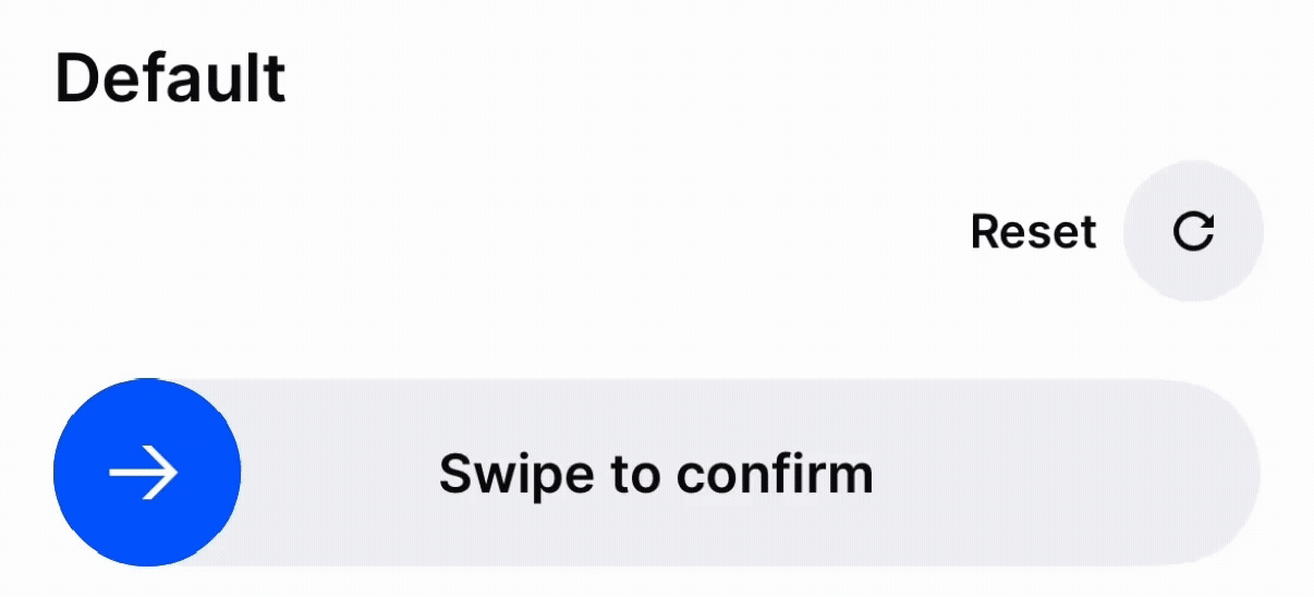
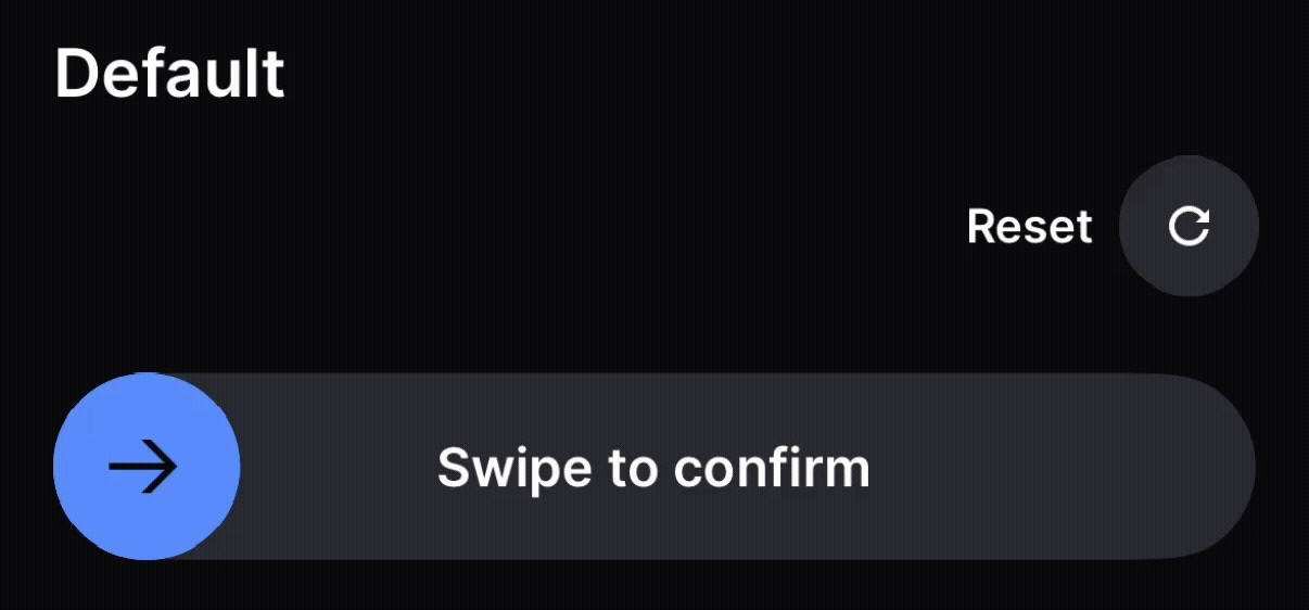
Basics
Use the onChange callback to update the checked state. This is the primary callback that controls both the visual and accessible state of the component.
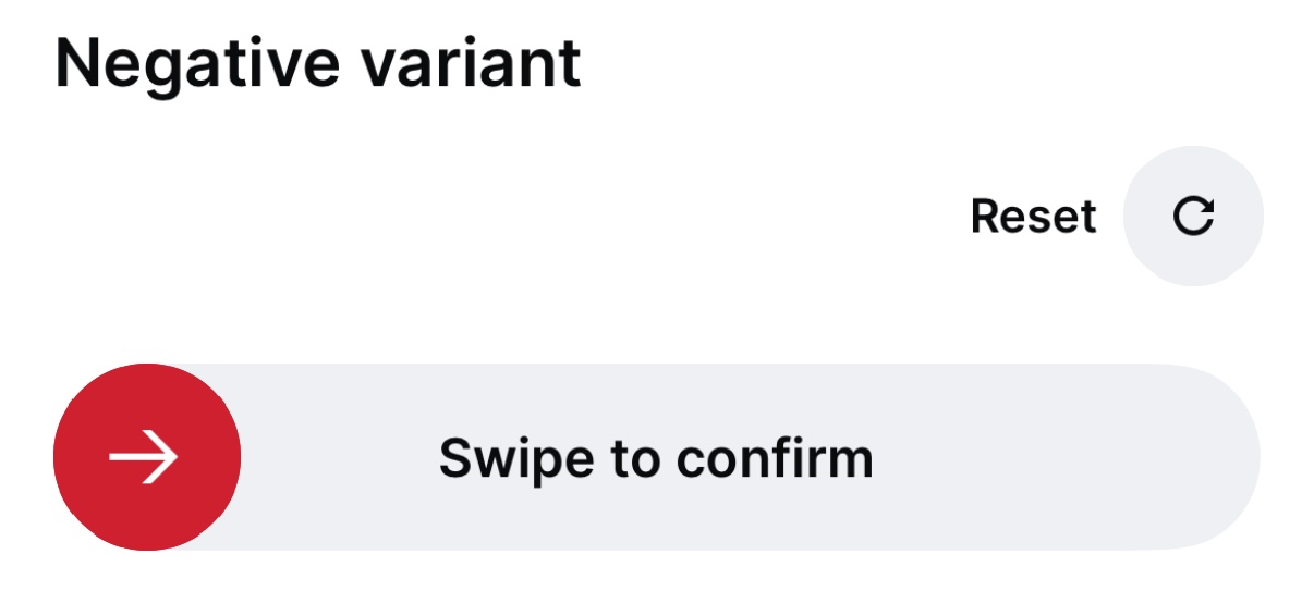
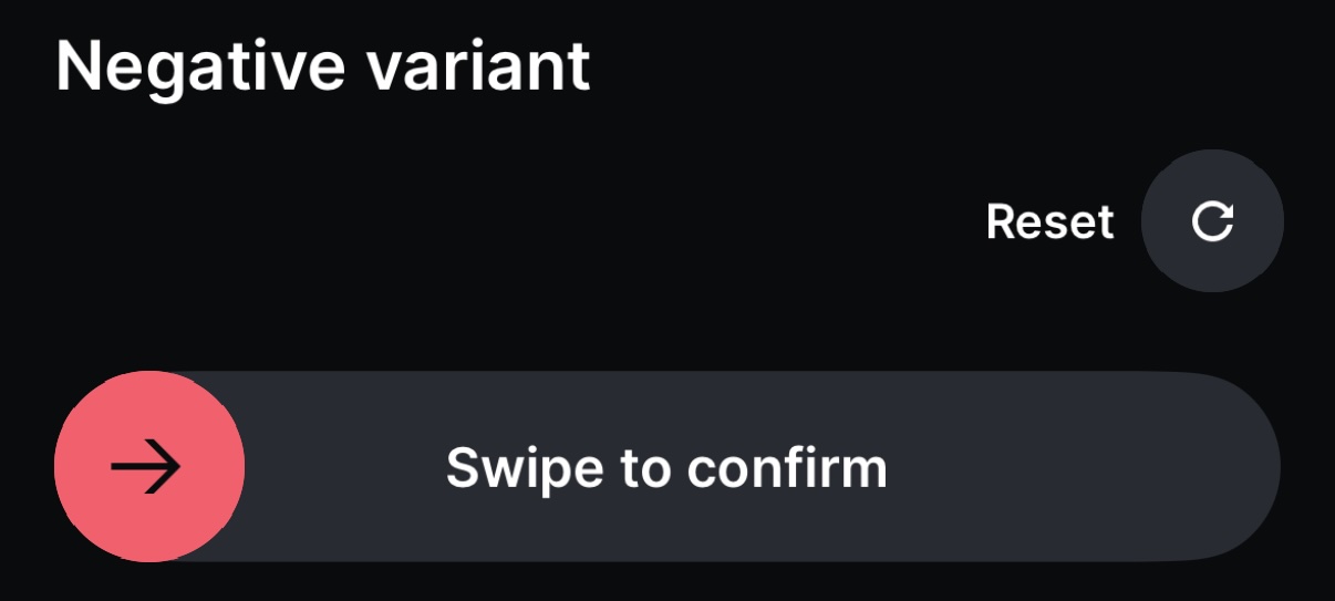
Variants
Use the variant prop to change the color of the button. The default variant is primary. Available variants are negative and positive.
Compact
Use the compact prop to reduce the height, border-radius and padding of the button:
Disabled
Use the disabled prop to prevent interaction. This works for both unchecked and checked states.
Auto Complete on Threshold
By default, the user must release the handle past the threshold to complete. Set autoCompleteSlideOnThresholdMet to automatically complete as soon as the threshold is reached, without requiring release.
You can also adjust the threshold via checkThreshold (a value from 0 to 1, defaulting to 0.7).
Callback Lifecycle
SlideButton fires callbacks in a specific order during the slide gesture:
onSlideStart-- when the gesture beginsonChange-- when the slide completes past the threshold (setscheckedtotrue)onSlideComplete-- immediately afteronChangeonSlideEnd-- always fires last
If the user releases before the threshold, onSlideCancel fires instead, followed by onSlideEnd.
Important: Always use onChange to manage the checked state. The checked prop drives the component's accessibilityLabel (switching between uncheckedLabel and checkedLabel), so failing to update it means screen readers won't announce the state change. Use onSlideComplete only for supplementary side effects (e.g. analytics, haptic feedback) that don't affect accessible state.
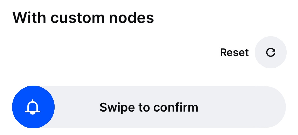
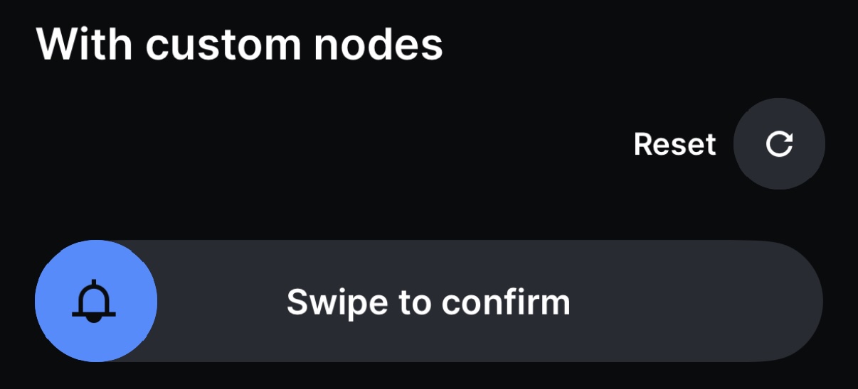
Custom Nodes
Use startUncheckedNode and endCheckedNode to replace the default arrow icon and loading indicator on the handle.
Labels as Nodes
The uncheckedLabel and checkedLabel props accept ReactNode, so you can pass custom styled text or other components. When using non-string labels, the component uses accessibilityLabelledBy to associate the handle with the container element, so ensure your label nodes contain meaningful text content.
Custom Border Radius
Use borderRadius to customize the shape of both the handle and the background. Token values are resolved through the theme, so the handle and background always match.
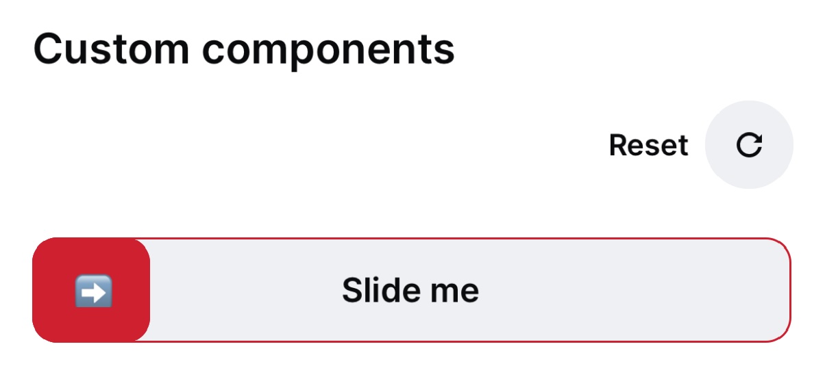
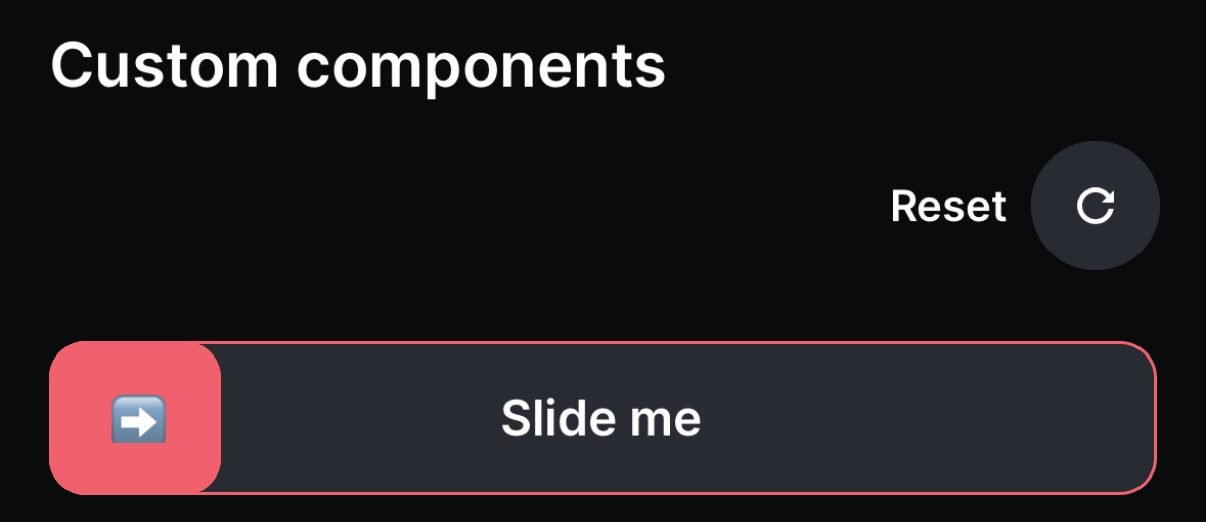
Custom Background and Handle Components
You can fully customize the background and handle by providing your own components via SlideButtonBackgroundComponent and SlideButtonHandleComponent. Your components receive typed props (SlideButtonBackgroundProps and SlideButtonHandleProps) including a progress spring value and the current checked state.
Accessibility
SlideButton has built-in accessibility support. The component automatically derives its accessibilityLabel from the checked state -- displaying uncheckedLabel when unchecked and checkedLabel when checked. It also registers an activate accessibility action so screen readers can trigger the slide without performing a gesture.
Use onChange as your primary callback. The onChange callback updates the checked prop, which controls the accessible label. Placing critical logic in onSlideComplete without updating checked via onChange will leave the accessible state stale, meaning screen readers won't announce the confirmation.
When providing a custom SlideButtonHandleComponent, always spread the incoming props to preserve the built-in accessibilityActions and onAccessibilityAction handlers, and set accessibilityLabel and accessibilityRole="button" on the handle element.
When using ReactNode labels instead of strings, the component uses accessibilityLabelledBy to link to the container element, so ensure your custom label nodes contain meaningful text.