Numpad
A keypad for entering numbers.@coinbase/cds-mobile@9.28.0
import { Numpad } from '@coinbase/cds-mobile/numpad/Numpad'
Related components
Pin Numpad
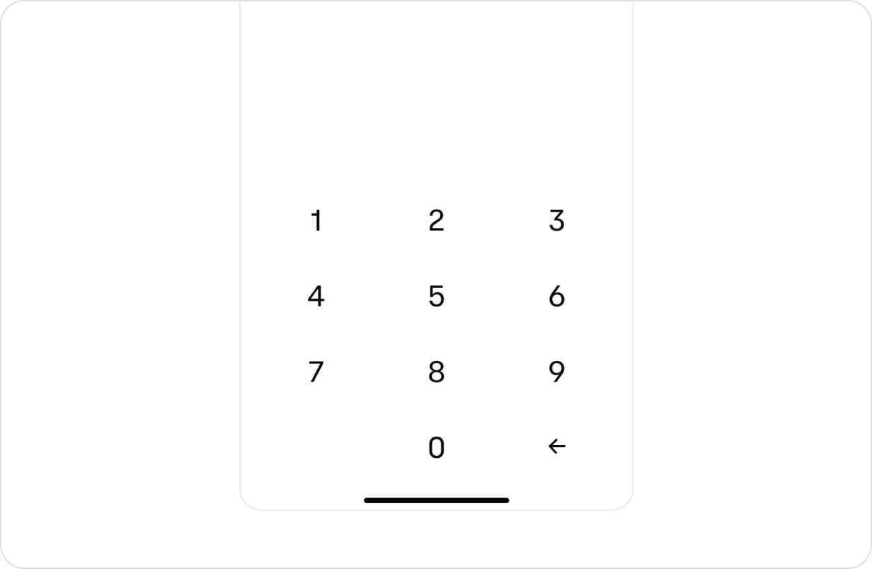
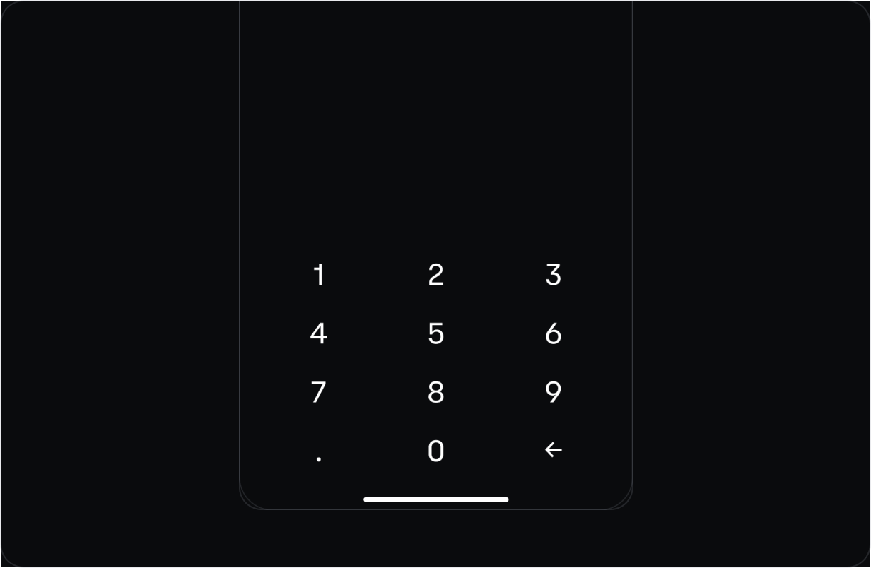
Primary use case for this is when a user is inputing a PIN code. Notice it does not have any of the hallmarks of a transactional numpad (CTA, utility button, suggested amounts).
When the decimal separator isn't needed, pass hideSeparator to fully hide it. This visually removes the separator key and also removes it from the accessibility tree, so it is not focusable by screen readers such as VoiceOver and TalkBack.
const PinNumpadExample = () => {
  // localState
  const [visible, { toggleOn, toggleOff }] = useToggler(false);
  const [value, setValue] = useState('');

  // hooks
  const safeBottomPadding = useSafeBottomPadding();
  const palette = usePalette();

  // callbacks
  const onPress = useCallback((input: NumpadValue) => {
    if (input === DELETE) {
      setValue((preValue) => preValue.slice(0, -1));
    } else if (input !== SEPARATOR) {
      setValue((prevValue) => (prevValue.length < 4 ? prevValue + input : prevValue));
    }
  }, []);

  const onLongPress = useCallback((input: NumpadValue) => {
    if (input === DELETE) {
      setValue('');
    } else if (input !== SEPARATOR) {
      setValue((prevValue) => (prevValue.length < 4 ? prevValue + input : prevValue));
    }
  }, []);

  return (
    <VStack>
      <Button onPress={toggleOn}>Example 2</Button>
      <Modal onRequestClose={toggleOff} visible={visible}>
        <ModalHeader title="PinCode Entry" />
        <ModalBody>
          <VStack alignItems="center" gap={2} paddingTop={8}>
            <HStack>
              {Array.from({ length: 4 }).map((_, index) => (
                <View
                  // eslint-disable-next-line react/no-array-index-key
                  key={index}
                  style={{
                    width: 16,
                    height: 16,
                    borderWidth: 2,
                    borderRadius: 10,
                    borderColor: index < value.length ? palette.primary : palette.backgroundOverlay,
                    backgroundColor: index < value.length ? palette.primary : palette.transparent,
                    margin: 5,
                  }}
                />
              ))}
            </HStack>
            <Text font="headline">Unlock with your PIN</Text>
          </VStack>
        </ModalBody>
        <Box bottom={0} position="absolute" paddingBottom={safeBottomPadding}>
          <Numpad hideSeparator onLongPress={onLongPress} onPress={onPress} />
        </Box>
      </Modal>
    </VStack>
  );
};
Transactional Numpad
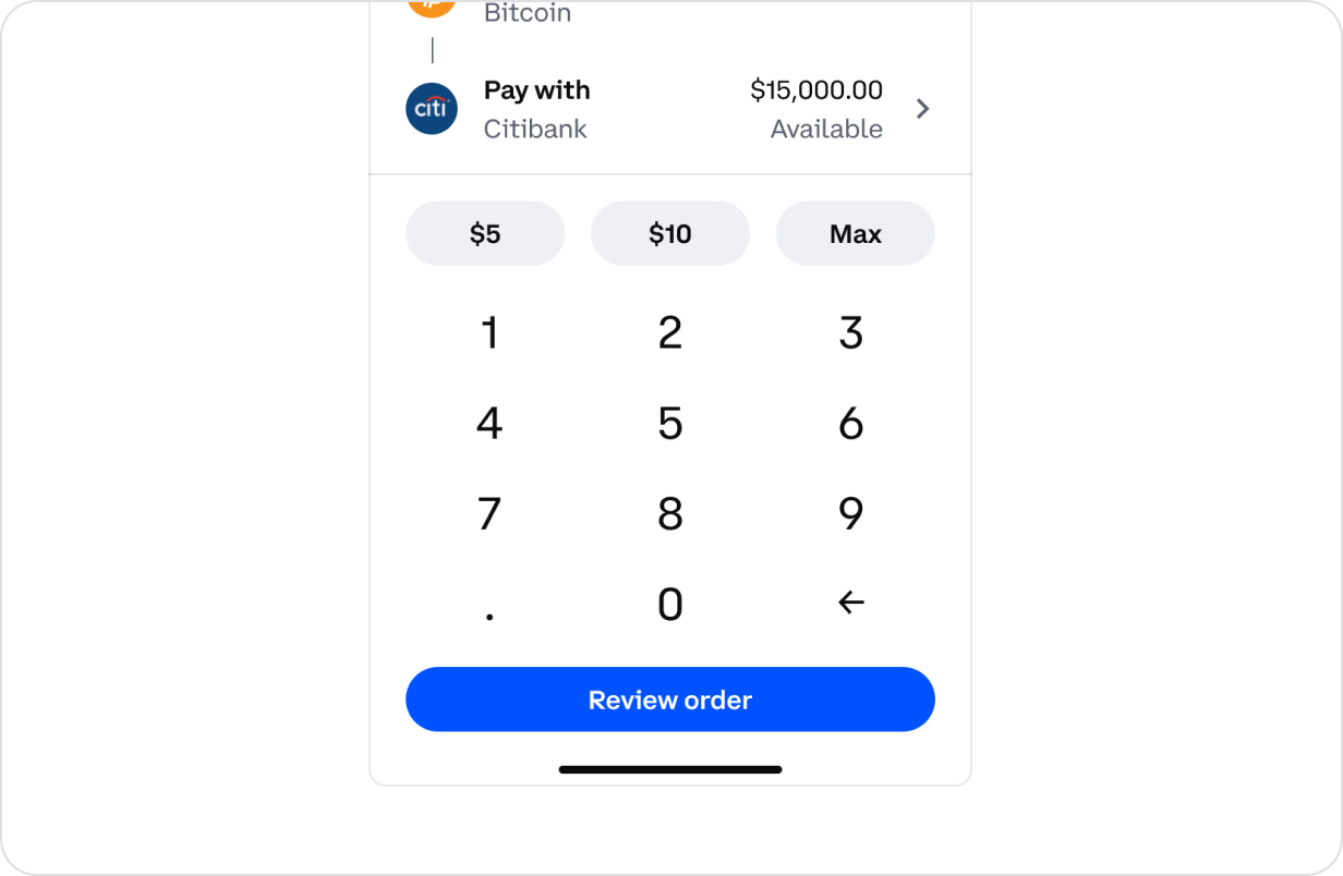
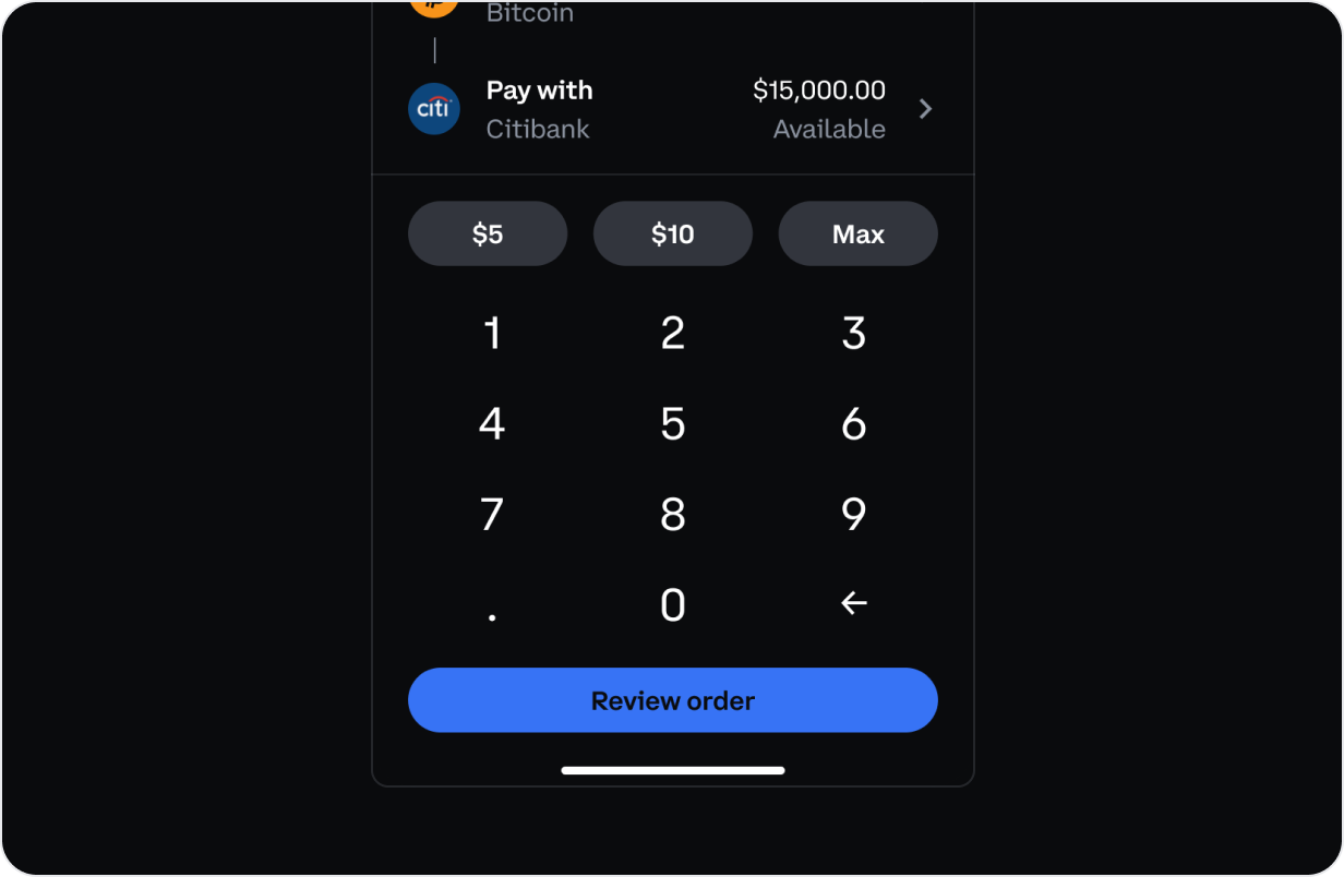
Best when used in the context of a transactional scenario. This could range from the standard Buy / Sell, all the way to Gift, Convert, Stake, etc.
const VALUE_MAX = 1000000;
const TransactionalNumpadExample = () => {
  const [visible, { toggleOn, toggleOff }] = useToggler(false);
  const [value, setValue] = useState('100');
  const safeBottomPadding = useSafeBottomPadding();

  const onPress = useCallback((value: NumpadValue) => {
    switch (value) {
      case DELETE:
        setValue((prev) => prev.slice(0, -1));
        break;
      case SEPARATOR:
        setValue((prev) => (prev.includes('.') ? prev : `${prev}.`));
        break;
      default:
        setValue((prev) => {
          const newValue = prev + value;
          return parseFloat(newValue) > VALUE_MAX ? prev : newValue;
        });
    }
  }, []);

  const onLongPress = useCallback((value: NumpadValue) => {
    switch (value) {
      case DELETE:
        setValue('');
        break;
      case SEPARATOR:
        if (!value.includes('.')) {
          setValue((prevValue) => `${prevValue}.00`);
        }
        break;
      default:
        setValue((prev) => {
          const newValue = prev + value;
          return parseFloat(newValue) > VALUE_MAX ? prev : newValue;
        });
    }
  }, []);

  const setValueCallback = useCallback((value: string) => () => setValue(value), []);

  const accessory = useMemo(() => {
    if (value === '')
      return (
        <Banner
          bordered={false}
          numberOfLines={1}
          startIcon="error"
          startIconActive
          title="Invalid Input"
          variant="warning"
        >
          <Text>Enter an amount greater than zero.</Text>
        </Banner>
      );
    if (parseFloat(value) >= VALUE_MAX) {
      return (
        <Banner
          bordered={false}
          numberOfLines={1}
          startIcon="error"
          startIconActive
          title="You've reached the maximum value"
          variant="warning"
        >
          <Text>Max ${VALUE_MAX}</Text>
        </Banner>
      );
    }

    return (
      <VStack paddingX={3}>
        <ButtonGroup block>
          <Button compact onPress={setValueCallback('5')} variant="secondary">
            $5
          </Button>
          <Button compact onPress={setValueCallback('10')} variant="secondary">
            $10
          </Button>
          <Button compact onPress={setValueCallback(VALUE_MAX.toString())} variant="secondary">
            Max
          </Button>
        </ButtonGroup>
      </VStack>
    );
  }, [setValueCallback, value]);

  return (
    <VStack>
      <Button onPress={toggleOn}>Example 1</Button>
      <Modal onRequestClose={toggleOff} visible={visible}>
        <ModalHeader title="BuyAsset Entry" />
        <ModalBody>
          <TextInput
            accessibilityLabel="Text input field"
            helperText="Max $1000000"
            label="Enter amount (USD)"
            placeholder="USD"
            value={value}
          />
        </ModalBody>
        <Box
          borderedTop
          borderColor="secondary"
          bottom={0}
          position="absolute"
          paddingTop={2}
          paddingBottom={safeBottomPadding}
        >
          <Numpad
            accessory={accessory}
            action={
              <VStack paddingX={2}>
                <Button onPress={toggleOff}>Review order</Button>
              </VStack>
            }
            deleteAccessibilityLabel="delete"
            onLongPress={onLongPress}
            onPress={onPress}
            separatorAccessibilityLabel="period"
          />
        </Box>
      </Modal>
    </VStack>
  );
};